Screener (Premium Desktop Feature)
Screener
Located under the Find Tab, the Advanced Screener is designed to allow the user to customize their own trade candidate searches. Several hundred data points are available to select from, build your Screen, Save for future use and Edit as needed.
Screener is flexible – allowing you to create save as many Screen searches as you wish, edit as needed, even download results.
Screens are user-defined, and 100% customized to the user’s specifications. They can be edited, saved, and deleted.
Left Control Panel
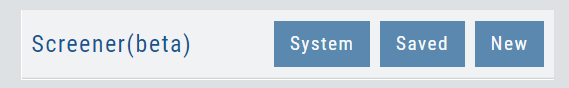
New – Create a new screener
Saved – Previously created and saved screens. Saved screens can be edited for single use, saved as a new screen, or to overwrite the previously saved screen
System – Templates available for use as starting points for new screeners. While the System screens themselves cannot be modified, they can be used as a foundation for newly created screens that can be modified for personal use and saved.
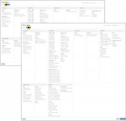
Select your criteria
There are 3 Levels of Data.
Level 1 offers Basic Information to select from. Level 2 expands upon what Level 1 offers. Level 3 offers all available, in-depth selections.
After choosing your criteria, you’ll be able to set the parameters for each criteria selection on the next screen.
Click “Run Search”
Note: The order the criteria are selected, will be the order the selections are displayed on the next screen.
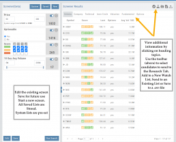
The Results
The criteria selected in this example were Price ($50-200), Optionable, Score (Green or Yellow for each Icon), and 10-day Average Volume (5M-293M) resulting in 17 candidates.
From here, using the Icon Toolbar, candidates can be selected and:
- Sent to Research for further analysis
- Sent to an existing Watch List
- Used to create a New list
- Can be downloaded to a .csv file.
The Screen itself can be Saved (and named), or further modified – either by
adjusting the existing criteria or adding new data points – or a New Screen
can be created.
Additional data is accessible by clicking on “Company”, “Technical”, etc
above the list of candidates.
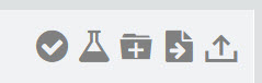
Icon Tool Bar – Hover Cursor over Icon to view function
Select one or more symbols
Send selections to Research
Create a New Watchlist with Selected Candidates
Send Candidate to an Existing Watchlist
Download to .csv file
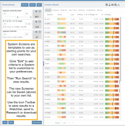
System Screens are also available and new ones will be added.
The user can customize such screens and save to the platform just as any other
screen.
Candidates can be sent to Research, to a Watch List and/or
downloaded to a .csv file.
System Screens themselves cannot be modified and are designed to be
‘launching points’ for the user’s convenience if they wish to use them.
Note the colored bar graph of IV Range. It provides a ‘picture’ of where this
Stock/ETF is now for this datapoint.
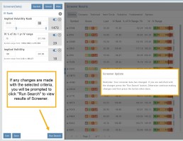
Edit Screeners
Edit current, Saved or System Screeners by adjusting parameters of existing criteria using the slide bars, entering values in boxes, etc.
A Screener Update notice will appear prompting you to select “Run Search” after adjustments are completed. Updated results will populate the left table.
From here, use the Icon Toolbar for further options: Select, Add to Watchlist, Research or Download.
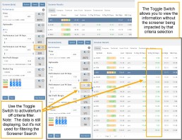
Toggle Criteria
The Toggle feature gives you additional flexibility in your Screener searches.
The ON position includes the selected criteria in calculating results.
The OFF position for that criteria will not affect the results when used to filter results. However, that data column will still be displayed with the other points selected.
Heap Map View
Each box in the Map View represents either an industry group or a stock when you drill down. The size of the box represents the market cap. 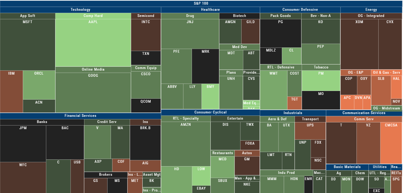
The color represents the data displayed (default : % change) for the time frame selected.
In the Market Tab, select the ‘Go Big’ option in Heat Map for more detail.
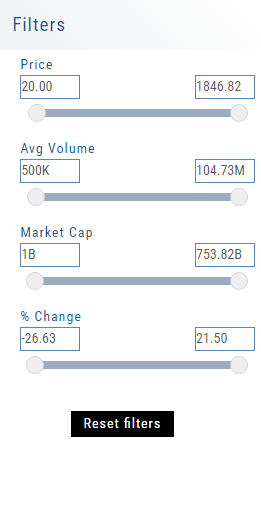
You have the capability to adjust your Map based on Stock Price, Average Volume, Market Cap and % Change.
Bonus: The platform will remember your filters until you reset them during the current session.
52 Week High/Low Value
The 52 Hi/Low Value represents the current percentile of the stock (or sector) relative to it’s 52 week 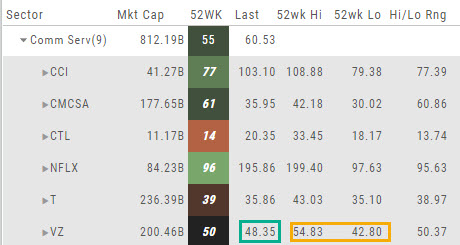 high/low price range. The Sector Value is the average of stocks within that sector.
In the Communication Services example, the average for the Sector is 55. When expanded, we see Netflix (NFLX) is near the top of it’s 52-week range at 96. Centurylink (CTL) is closer to the low end of it’s range at 14. Verizon’s current price is in the middle of the High-Low range.
This information is also available on the Map View but hovering your cursor over a stock tile while in 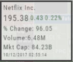 the 52 Wk Hi-Low View. Netflix shows the stock is at the 96th percentile of it’s high-low range.
Remember, you can refer to the Legend (found in the upper right part of the screen) for defined range values for any criteria view you select.
Heat Map Filters
Bonus! The Platform remembers your Preferences!
Select the view you like and it will be saved during your current session – even when you navigate elsewhere on the platform. The system will remember the map/spectrum view you set. This includes the type and time period as well.
Streamline your results by using the Filters for Price, Average Volume, Market Cap, and more. The data will be displayed dynamically based on filter changes. You can set your filters and the Platform will remember it until you change or reset it during the current session.