Heat Map & Spectrum Overview
Broad Market Insight that allows you to drill down
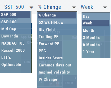
The Heat Maps are accessible in the Market tab and under Find>Explore and provide powerful visual views of market performance. This feature is designed to adapt to a variety of strategies and outlooks according to your portfolio needs. Select Index and Time Frame using the Action Icons. These can be changed going forward in any map screen.
In the Map view, each box represents either an industry group (default) or a stock when you drill down. The size of the box represents the market cap. By hovering your cursor over each box, an info box appears with info on that group within that industry, including the the number of companies, Market Cap, % Change in selected time frame.
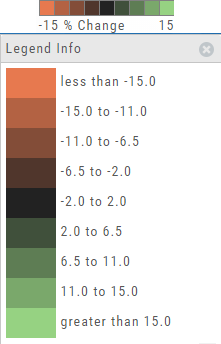
The Legend - Heat and Spectrum Maps
The Legend shows the range of % negative or positive change represented by a color spectrum. It is important to note: the range does adjust according to the data filters you select for the Heat or Spectrum Maps.
Clicking on the legend will show specific range of each color in the spectrum and give additional information about the definition.
Heap Map View
Each box in the Map View represents either an industry group or a stock when you drill down. The size of the box represents the market cap. 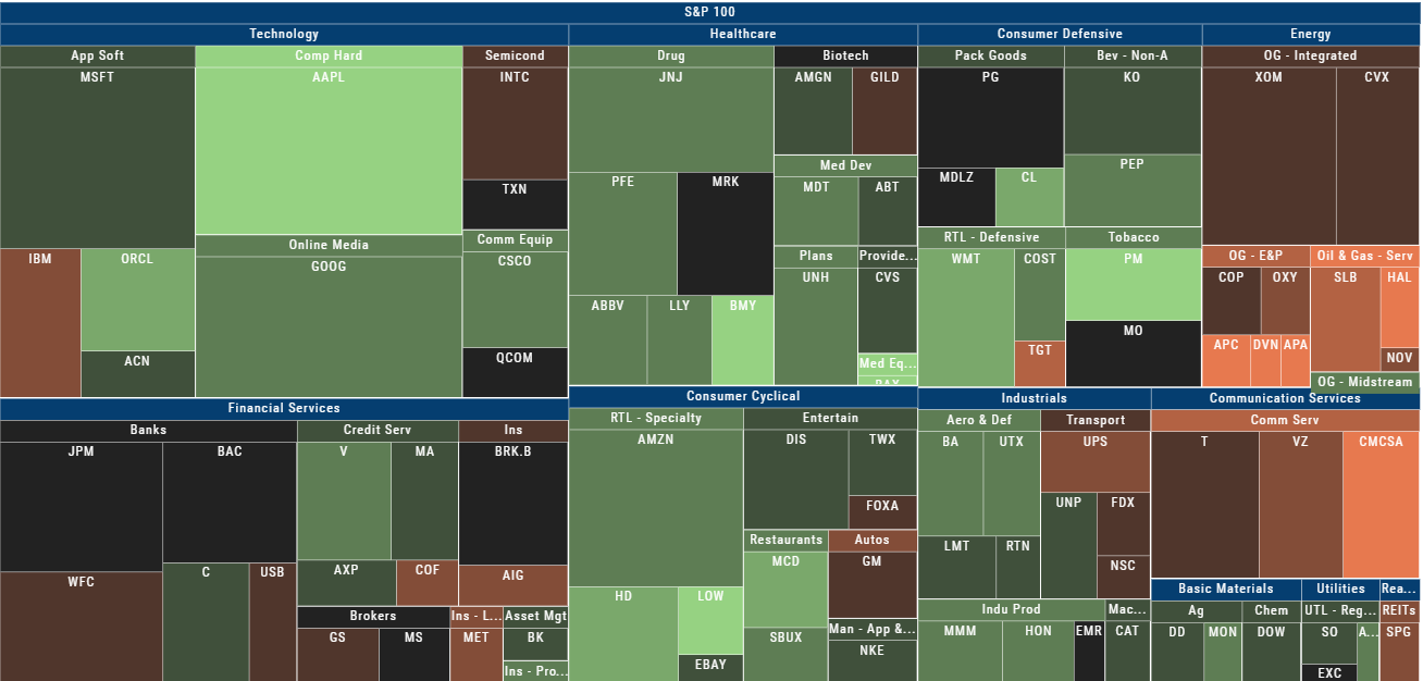
The color represents the data displayed (default : % change) for the time frame selected.
In the Market Tab, select the ‘Go Big’ option in Heat Map for more detail.
You have the capability to adjust your Map based on Stock Price, Average Volume, Market Cap and % Change.
Bonus: The platform will remember your filters until you reset them during the current session.
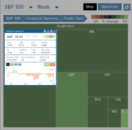
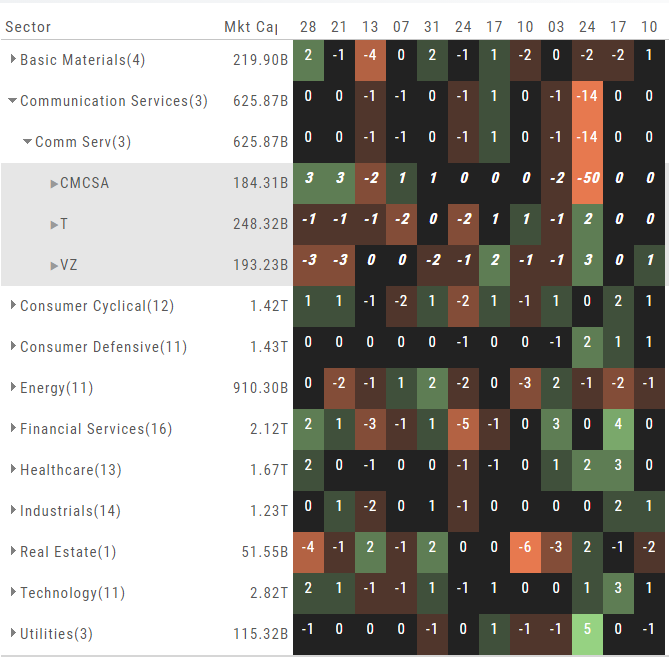
Spectrum Map View
In the Spectrum view, each column represents the slice of time selected: Day, Week, Month or Trailing Quarter. Once the Time frame is selected, it will be backtracked in each column (Example: April, March, February, January…)
Each row of the selected Index are initially broken down by Sector. By clicking the ‘action icon’, the Industry groups are shown. Clicking on the ‘action icon’ of each Industry will display the Stock symbols within that Industry.
The number and color of each box is a ‘slice’ that represents change (+/- , neutral) for that slice of time for that Sector, Industry or Stock using the Spectrum Color Legend as a reference.
Note the ‘action icon’ next to the Stock Symbol, enabling you to drill down, add to Watchlist, Research, Journal, etc.
Heat Map Data Points
Drop-down menus allow you to select Index, Time Frame and various Data Points. Choose among % Change, Dividend Yield, PEG, 52 week High-Low and more.
Special Maps like Insider Score, Days to Next Earnings, and Implied Volatility are also included.
And of course, by selecting an individual box (stock) for Quote Detail and use the Navigational Icons to Research, add to Watch Lists, Submit a Trade, etc.
52 Week High/Low Value
The 52 Hi/Low Value represents the current percentile of the stock (or sector) relative to it’s 52 week 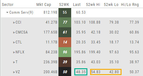 high/low price range. The Sector Value is the average of stocks within that sector.
In the Communication Services example, the average for the Sector is 55. When expanded, we see Netflix (NFLX) is near the top of it’s 52-week range at 96. Centurylink (CTL) is closer to the low end of it’s range at 14. Verizon’s current price is in the middle of the High-Low range.
This information is also available on the Map View but hovering your cursor over a stock tile while in 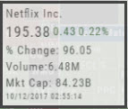 the 52 Wk Hi-Low View. Netflix shows the stock is at the 96th percentile of it’s high-low range.
Remember, you can refer to the Legend (found in the upper right part of the screen) for defined range values for any criteria view you select.
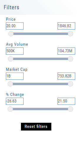
Heat Map Filters
Bonus! The Platform remembers your Preferences!
Select the view you like and it will be saved during your current session – even when you navigate elsewhere on the platform. The system will remember the map/spectrum view you set. This includes the type and time period as well.
Streamline your results by using the Filters for Price, Average Volume, Market Cap, and more. The data will be displayed dynamically based on filter changes. You can set your filters and the Platform will remember it until you change or reset it during the current session.
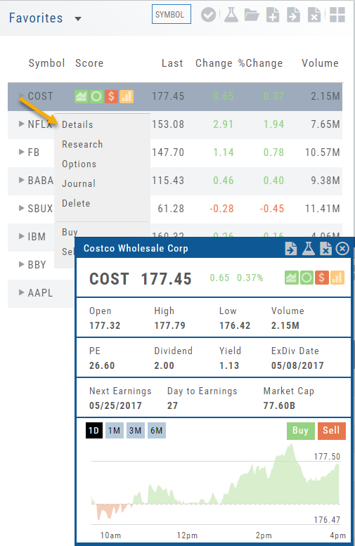
Quote Detail without leaving the List
A quick snapshot of a stock with navigational tools.
The Action Arrow Icon will provide a pop-up Quote Detail window including the current price, trading volume, Dividend Date -if applicable, Earnings Date and more. A chart, on the bottom part of the Detail Box, allows for difference periodices: 1 Day, 1,3 or 6 Months.
Notice the additional icons in the Quote Detail: You can send this stock to one of your Watch Lists, to Research or delete the stock if you wish. The Score Icons will direct you to the appropriate Research function. Buy/Sell buttons allow for quick order placing.