Platform Features Release: Annotation Enhancements, Condor Trade Set Up
Announcing the latest Release of Annotation improvements and Strategy template adjustment. We’ve also made several practical changes for better access to features/functions.
Independent Default Settings for Annotations
When adding Annotations such as lines, rays, arrows, etc, to the chart, the settings for that type of annotation can be set as a “Default”. Line settings are independent of other annotations’ settings.
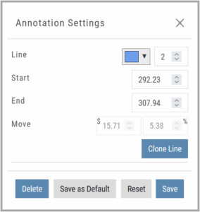
Add the Annotation.
Click on the annotation to display the Dialog box (shown).
Make any adjustments.
Click “Save as Default”
The newly added and future annotations of the same type will have the new settings.
Click “Reset” to revert to original settings.
Fibonacci Too!
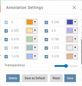 The Fibonacci Annotation has been enhanced to allow you to select which Retracement Levels you want to view in addition to adjusting the color for each as well as transparency overall.
The settings can be set as the Default for new chart entries.
**Please note: Existing Fibonacci annotations cannot be edited with this new coding. They must be deleted, then added back.
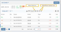
Condor Strategy Template Adjustment
The core functionality of Condor Strategy Templates has been adjusted. (Iron/Long/Short)
The center strikes are now anchored by default and will only change if you adjust them manually on the template itself or by using the “Widen Strike” icon —making trade construction more intuitive and consistent.
Widening/Narrowing of the center Strikes will change the spread of the Condor, which can be done manually on the template or by using the “Widen” or “Narrow Spread” icon.
Other Additions
- EOD lower Indicators will display “Chart Unavailable for intraday charts.”
- Zoom feature now includes a double-click “on-off” functionality
- HeatMap legend (Find>HeatMap) is movable
Change Log
- Heatmap legend is no longer fixed when clicked to view
- Transparency for shapes is resolved
- Price slice functionality adjusted for price changes
- Zoom feature is now toggle functionality
- Scrolling chart/arrow functionality resolved
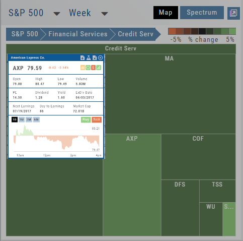
Create Watchlists from Spectrum View
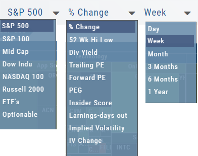
Spectrum View can be used to create or add Watchlists
1. Select the Group, Operator and Time Period
Example: Optionable, % Change, 1 Week
2. Apply Filter for Price, Volume, Market Cap and the Selected Operator
3. Click the Arrow next to the Sector to expand to Industry, repeat to display list of stocks that fits the filtered criteria.
4. Use the Icon Toolbar to multi/select symbols to either send to an existing Watchlist or Create a New List.
Use the same filters on the HeatMap View to customize your search.
The box size denotes the Market Cap size.
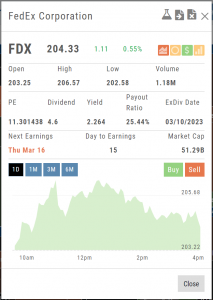
Click on the individual box to view:
Market Activity
Earning/Dividend info,
View Chart Periods
Buy/Sell stock
Send to Research
Add to an Existing Watchlist.
Heat Map & Spectrum Overview
Broad Market Insight that allows you to drill down
The Heat Maps are accessible in the Market tab and under Find>Explore and provide powerful visual views of market performance. This feature is designed to adapt to a variety of strategies and outlooks according to your portfolio needs. Select Index and Time Frame using the Action Icons. These can be changed going forward in any map screen.
In the Map view, each box represents either an industry group (default) or a stock when you drill down. The size of the box represents the market cap. By hovering your cursor over each box, an info box appears with info on that group within that industry, including the the number of companies, Market Cap, % Change in selected time frame.
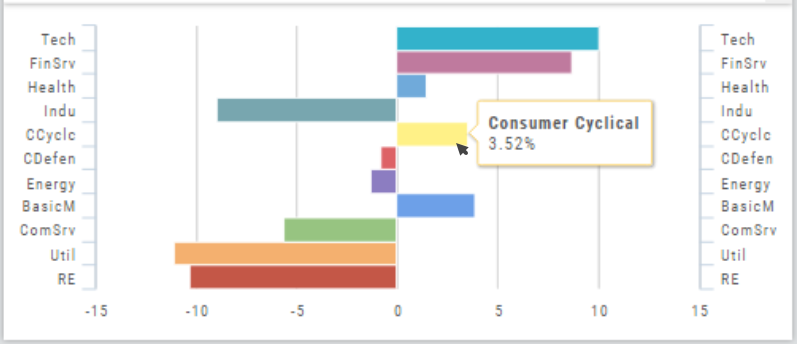
Industry Performance Bar Chart
The Bar Chart is located on the Market Tab and updates dynamically with selected Heat Map Index and Time Frame. This provides an additional view of the overall Market by Industry. Below is a 3 month Heat Map/Bar Chart view of the S&P 500. The bottom Bar Chart shows a 6 month view.
Each Industry is represented by a unique color and are listed by Market Cap – largest on top to the smallest at the bottom. Hover your cursor over each bar for the Industry name and % change of the selected time period to appear.
The center of the Chart is Neutral and will appear blank just prior to the Market’s Opening Bell. Bars extending right of center represents Gains, left of center represents a Loss for the time period selected on the Heat Map.
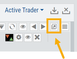
Go Big - Graphs & Charts
Anywhere you see the ‘Go Big’ icon ![]() , you can expand the graphic and access additional information.
, you can expand the graphic and access additional information.
The Chart Tab under Research has such a button in the icon toolbar as shown:
The Heat Map on the Market Tab will allow you to filter criteria such as stock price, volume, market cap, etc. 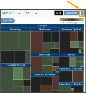
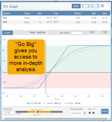
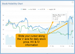
In the Options Tab, you can do this with the P/L Graph and the Volatility Chart. The icon is located at or near the upper right of the graph or chart.
Expanding the Stock/Volatility Chart allows you to view past Historic Volatility, Intrinsic Volatility and stock price on a day-to-day basis.
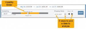
For deeper Trade Analysis, use the Volatility Slider tool and the Date Picker, located at the bottom of the P&L Graph:
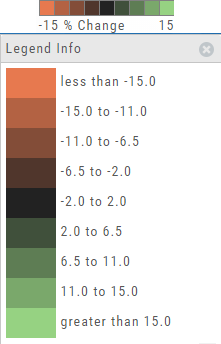
The Legend - Heat and Spectrum Maps
The Legend shows the range of % negative or positive change represented by a color spectrum. It is important to note: the range does adjust according to the data filters you select for the Heat or Spectrum Maps.
Clicking on the legend will show specific range of each color in the spectrum and give additional information about the definition.
Heap Map View
Each box in the Map View represents either an industry group or a stock when you drill down. The size of the box represents the market cap. 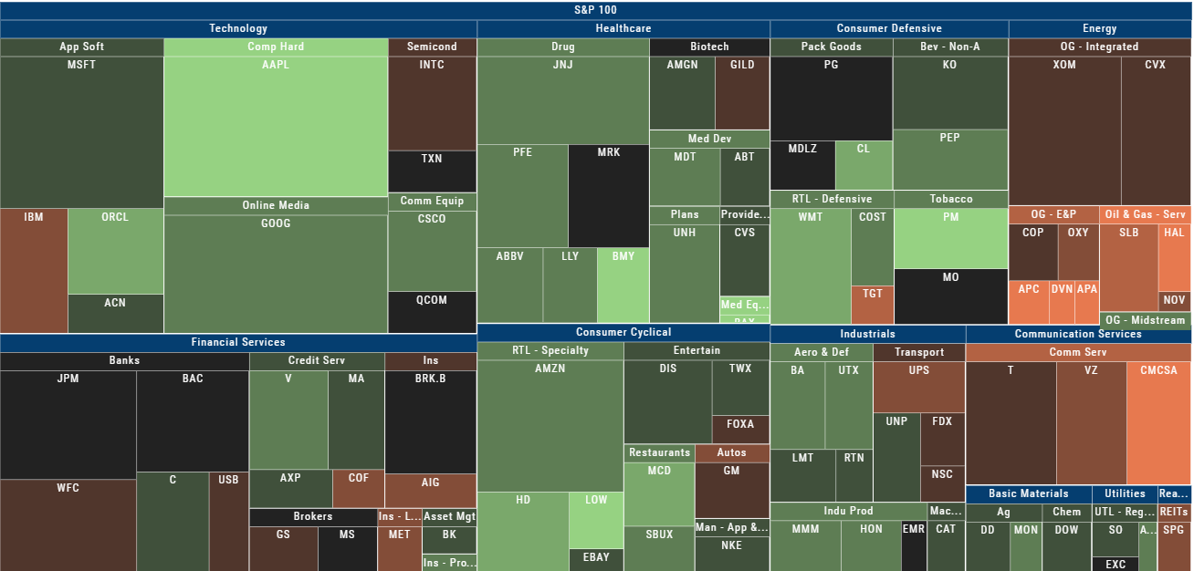
The color represents the data displayed (default : % change) for the time frame selected.
In the Market Tab, select the ‘Go Big’ option in Heat Map for more detail.
You have the capability to adjust your Map based on Stock Price, Average Volume, Market Cap and % Change.
Bonus: The platform will remember your filters until you reset them during the current session.
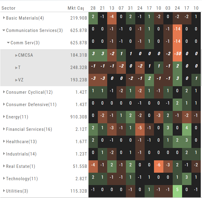
Spectrum Map View
In the Spectrum view, each column represents the slice of time selected: Day, Week, Month or Trailing Quarter. Once the Time frame is selected, it will be backtracked in each column (Example: April, March, February, January…)
Each row of the selected Index are initially broken down by Sector. By clicking the ‘action icon’, the Industry groups are shown. Clicking on the ‘action icon’ of each Industry will display the Stock symbols within that Industry.
The number and color of each box is a ‘slice’ that represents change (+/- , neutral) for that slice of time for that Sector, Industry or Stock using the Spectrum Color Legend as a reference.
Note the ‘action icon’ next to the Stock Symbol, enabling you to drill down, add to Watchlist, Research, Journal, etc.
Heat Map Data Points
Drop-down menus allow you to select Index, Time Frame and various Data Points. Choose among % Change, Dividend Yield, PEG, 52 week High-Low and more.
Special Maps like Insider Score, Days to Next Earnings, and Implied Volatility are also included.
And of course, by selecting an individual box (stock) for Quote Detail and use the Navigational Icons to Research, add to Watch Lists, Submit a Trade, etc.
52 Week High/Low Value
The 52 Hi/Low Value represents the current percentile of the stock (or sector) relative to it’s 52 week 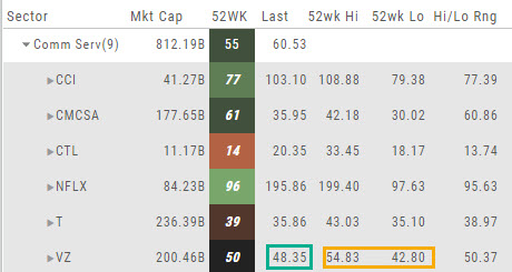 high/low price range. The Sector Value is the average of stocks within that sector.
In the Communication Services example, the average for the Sector is 55. When expanded, we see Netflix (NFLX) is near the top of it’s 52-week range at 96. Centurylink (CTL) is closer to the low end of it’s range at 14. Verizon’s current price is in the middle of the High-Low range.
This information is also available on the Map View but hovering your cursor over a stock tile while in 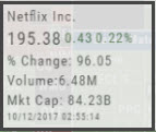 the 52 Wk Hi-Low View. Netflix shows the stock is at the 96th percentile of it’s high-low range.
Remember, you can refer to the Legend (found in the upper right part of the screen) for defined range values for any criteria view you select.